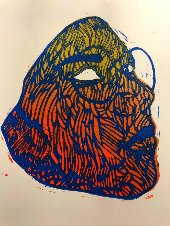
Title:Mariposa
Size: 25.5m by 40.6 cm
Medium: linoleum print
Date: October 2018
Mariposa or Butterfly, is a linoleum print inspired by Irving Herrera's own print portraits and Kehinde Wiley's compositions and vibrant color schemes. Mariposa is meant to represent resilience and anticipation towards the future. In this work I portray myself in the state of realization I would like to be in just as a butterfly reaches its final state.
Inspiration
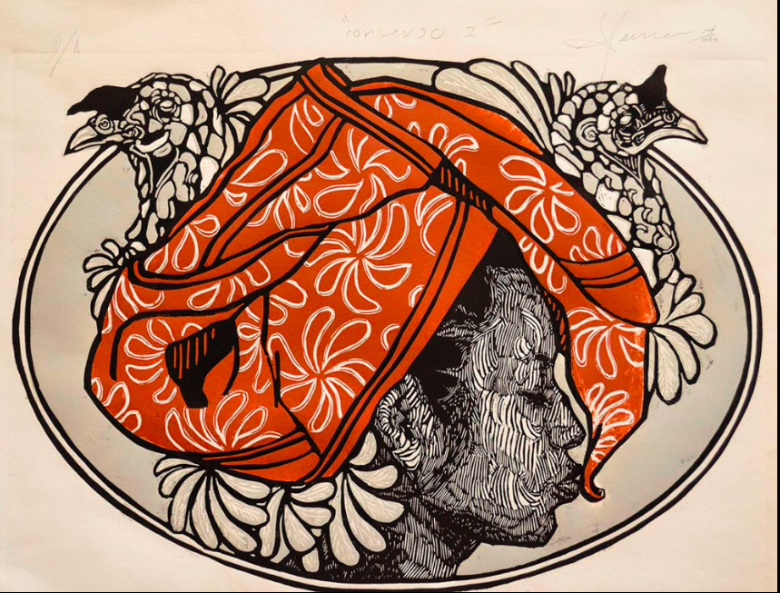
Before actually starting this work I already knew I wanted to create a linoleum block print. I really wanted to not only challenge myself in a medium that took away a lot of the ways in which I incorporate detail such as blending and rendering but also because I thought the process would help me be able to create patterns in the future. I wanted the ability to create intricate patterns on my work to create interest and not solely rely on what I could purchase. Taking these aspects into account when I found Irving Herrera's prints I was blown away by the incredible complexity of his line work and patterns. Looking at his work helped me further develop the way in which I planned to use patterns in my work. Before Pattern was always incorporated but separated from the primary subject, never was it onto itself the main focus. As I looked at Herrera's portraits I was inspired to challenge myself by creating a portrait where the detail was not only shown in the complexity of the pattern but have the pattern as the main component. Looking at his work made me want to challenge the way I had come to be comfortable with using a pattern as an inanimate subject and purely symbolic.
|
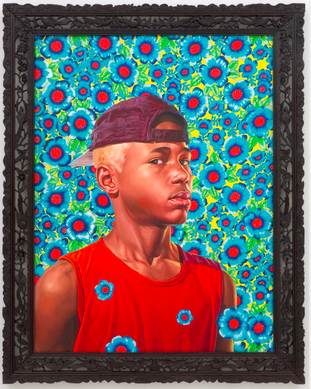
Kehinde Wiley’s technique has always been something I aimed to emulate but seeing as how I was creating a block print I also challenged myself to look at other techniques and aspects which I could emulate from his work. Looking at various pieces of his work and then when I attempted to emulate his painting technique I admired the vibrancy and stoic posses of his subjects. I took these aspects of his work and wanted to emphasize them in my work. I always thought my work lacked a resemblance towards his work and maybe heightening these aspects to their fullest extent in my block print would, later on, help be imitate the bravado in his work later on.
|
Ultimately in this work I took aesthetically pleasing aspects of both of the artist's work and attempted to give them my meaning in my own work through my own way.
Sketches
|
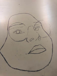
In this first sketch I had already traced a photo of myself onto the linoleum block I wanted to carve on. I really enjoyed the angle of the drawing but I had trouble envisioning how the pattern would appear on face. Originally I was going to just freehand the pattern but as I drew this and saw all of the angles on my face I didn't feel as confident in that technique.
|
|
|
This second sketch is just a progression of the first sketch. As the aspect of carving into the block made me feel uneasy I thought at least planning out the general directions I would carve in would help. Despite marking the higher points of the face, shadows, and general directions I still wasn't confident in the piece. Looking at this sketch was highly confusing to me and ultimately I was focusing on having my work look like Herrera's and not my own. I abandoned it because I couldn't envision all of the parts being carved out working as well as it working with the theme in mind, I wanted to create a butterfly and represent resilience but this sketch would have to primarily rely on color for that to have had worked.
|
|
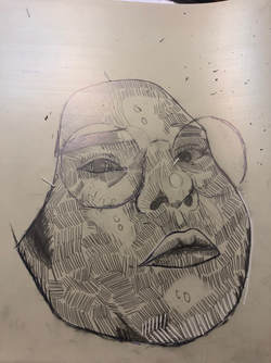
In this last sketch I changed the position to a similar one found in Herrera's work. In doing this I was able to look at his pattern more closely and replicate how his lines interact, thin, and expand as they cross over various areas of a face. Changing the position of the face also ultimately helped create a pattern that looked to me to be the wing of a butterfly. I ran with this idea as it would allow me to not only further work on the theme of persistence and resilience as butterflies are usually associated with not only hope but rebirth and new beginnings. Ultimately this sketch was completed and chosen because it was the clearest to follow and made the most sense considering the butterfly pattern I was attempting to replicate.
|
|
Process
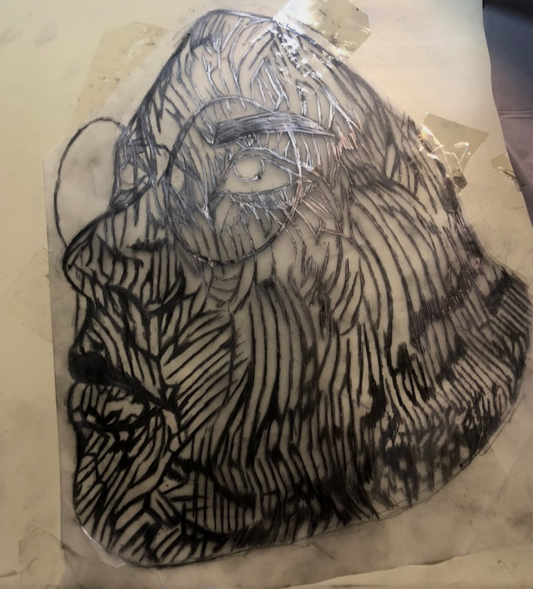
To begin this work I drew my design on tracing paper. I decided to draw it on tracing paper from the beginning because I knew it would become intricate and I wanted precision when carving my design. After I had finished drawing I attempted to turn the tracing paper over to re-trace so when I transferred the drawing onto the linoleum it would not be reversed. Despite my best attempts, I couldn’t really see my design from behind with all the small details so I settled for having it be the transferred as a mirror image. To begin transferring I taped down the transfer paper to the linoleum so it would not move If something were to happen. After taping it down I merely followed the design with a pencil until all of it was completely traced. Once I had made sure the whole image was on the block I removed the tracing paper. After removing the tracing paper I was ready to carve in with linoleum carvers.
To carve the piece I used primary three varying sized tips. These tips were all generally very small because much of the design involved carving out small sections. As I began to carve with the smallest of the tips I noticed it wasn’t very efficient at carving but rather cleaning up edges and that as I began to carve the hand I was holding the linoleum with would smudge the tracing. To adapt to these hardships I switched to a bigger tip that had less of a “V” shape and more of a “U” tip while tracing the pattern around what I was carving in pen. The change in tips allowed me to not only create small areas of negative space that are prevalent in Herrera's work but also tighten and clean other areas. After I had carved all the negative space for all parts of the print with the appropriate tips all that needed to happen was the actual printing.
To carve the piece I used primary three varying sized tips. These tips were all generally very small because much of the design involved carving out small sections. As I began to carve with the smallest of the tips I noticed it wasn’t very efficient at carving but rather cleaning up edges and that as I began to carve the hand I was holding the linoleum with would smudge the tracing. To adapt to these hardships I switched to a bigger tip that had less of a “V” shape and more of a “U” tip while tracing the pattern around what I was carving in pen. The change in tips allowed me to not only create small areas of negative space that are prevalent in Herrera's work but also tighten and clean other areas. After I had carved all the negative space for all parts of the print with the appropriate tips all that needed to happen was the actual printing.
Printing this print involved several parts and cycles of waiting. The first step in printing was preparing the station. To prepare I laid down paper underneath the whole area where I would be working. I then prepared the tray with the color of ink or inks I was ready to use. To choose these colors I looked back at Wiley's work in order to match the intensity which is also crucial to the central theme of the piece I carefully experimented with the brayer and a spatula as to how to apply the inks in gradients and ways I wanted. When I felt like the outcome of the brayer would be fruitful I tested it on a scrap piece of paper if it was what I was looking for I retested for how much I would get out of the brayer before I would lose that color pattern. I played with this as well as applying different inks on different places on the linoleum block to create different looks. After I had settled with the way I wanted the colors on the print to look I began printing. I printed the base orange and gold gradient first and waited for that to dry before I did anything else. Once that was done printing I then printed on the blue outline. To do this as accurately as possible I lined up the jaw of the print on the paper with jaw on the linoleum block. When I felt that I had matched both parts as best I could I pushed down on the print and began going over it with the baren. I paid special attention to the outline and jaw area which had many small areas carved out and made sure not to apply too much pressure. When I felt like I had done a good enough job with the baren I lifted the block to reveal the print and let it dry.
Experimentation
The experimentation in this art piece mainly involved me playing with colors and actual printing. While Herrera's work often only features 2 colors if any variation Wiley's work is drenched in vivid colors. I played with making a variation of gradient in horizontal or vertical directions. I also played with the intensity of the colors I used often adding black or white to the inks to make them darker or lighter. Since I wanted to represent reliance in my work I though would incorporate the almost neon hues in Wiley's work. Despite my initial intention to create a butterfly I hadn't completely settled on creating a monarch butterfly. I looked at various butterfly coloration and played with the hues I had available to me but despite how well the base print went the outline in whatever color looked off.In the end I settled on using orange and gold on top of bright blue in order to convey feelings of hopefulness that warm colors often bring. Along with this the blue instead of black was intended to to much like the outline to ground the piece and show restriction within the future.
Reflection
The outcome of this print was very underwhelming. As I am not used to working in the printing medium I do believe part of my disappointment is solely attributed to the outcome not being able to have the quality of detail I am used to with painting or illustration. I made several mistakes in both carving that attributed to my hate of the actual print since they impacted the accuracy of the prints properly laying where they needed to, Despite the positioning being off I do believe I managed to not directly emulate the way in which Herrera uses lines to create patterns but developed my own way based of my observations of his prints. Along with this I believe I was also able to manner in which Wiley uses not only composition but color to evoke importance and emotion from the viewer. In the end the errors in the piece furthered the theme by showing my resilience to continue creating despite the hardships I faced.
ACT Responses
1) Clearly explain how you are able to identify the cause-effect relationships between your inspiration and its effect upon your work?
The cause-effect in my inspiration led me to venture into different art styles. As a Result of wanting to experiment but still have something recognizably mine at the end I was able to take small aspects from other artists and incorporate them into my own work.
.
2) What is the overall approach(point of view) the author (from your research) has regarding the topic of your inspiration?
The overall research I conducted had a lot to do with how to create the effects I wanted with the materials I had at hand at thus the overall approach was unbiased and informative.
3) What kind of generalizations and conclusions have you discovered about people, ideas, cultures, etc. while you researched your inspiration?
From my research I can generalize that while color may attribute to the mood and tone of a piece repetition can also contribute to those same aspects of a work.
4) What was the central idea or theme around your inspirational research?
The Central Idea for my research was vibrance and extravagance. I wanted to find other ways to rely drama in my work and looking at various relationships between these two in works really opened my eyes to the various ways they can be conveyed.
5) What kind of inferences (conclusions reached on the basis of evidence and reasoning) did you make while reading your research?
While conducting research I came to the conclusion that there are many ways which one can achieve the same feeling in different mediums.
Citations
Herrera, Irving. “Conversol.” Irving Herrera, 2014, irvingherrera.wordpress.com/grabados-asaro/.
“Linocut Tutorial - How to Print a Colour Blend.” LinocutBoy, 18 Dec. 2012, linocutboy.com/linocut-tutorial-how-to-print-a-colour-blend/.
Wiley, Kehinde. “Randerson Romualdo Cordeiro .” Kehinde Wiley, 2008, kehindewiley.com/works/the-world-stage-brazil/.
“Linocut Tutorial - How to Print a Colour Blend.” LinocutBoy, 18 Dec. 2012, linocutboy.com/linocut-tutorial-how-to-print-a-colour-blend/.
Wiley, Kehinde. “Randerson Romualdo Cordeiro .” Kehinde Wiley, 2008, kehindewiley.com/works/the-world-stage-brazil/.
